Meridian.
A design system that treats comfort as a dimension, and its own governance as part of the product.
Meridian is the design-system infrastructure of an enterprise AI-workflow platform: a node-based canvas where teams compose automations, a marketplace of agents, dense power-user surfaces, multi-account governance. The kind of product where a design system either scales with you or quietly becomes your biggest debt.
The hypothesis: design knowledge should live as a system that humans and AI build from equally. Not documentation trailing the work. The source the work comes from.
AI made output cheap. It made coherence expensive.
I had been carrying this hypothesis for months before Meridian, adapting it to every context I touched. The observation behind it: AI-assisted production generates plausible screens endlessly, but every generated screen is a small fork of the truth. Screens got cheap; accountability didn't.
The invention is not a component library. It is a knowledge architecture where identity, structure, styles and context are written once, in formats a person and a machine read with the same fidelity, and everything visible is generated from that source. Meridian was the first place the idea met enterprise reality.
Four demands, one architecture.
iA dense node canvas
Infinite pannable space, nodes, edges, ports, in-canvas grouping. Power users living in it eight hours a day, needing compact density and instant scanability.
iiMarketplace surfaces
Agents and toolkits to discover, compare and import. Marketing-grade presentation living inside a working tool, one brand across both registers.
iiiMulti-account governance
Roles, permissions, organization switching. Interfaces that must feel calm while carrying real administrative weight.
ivTwo domains, one brand
A web surface and a workflow canvas with different physics but the same identity. The reason the architecture is layered instead of monolithic.
One source, three tiers, every layer accountable.
A single brand source owns the raw truth and hands it down in three tiers: HARD (non-negotiable brand values), SOFT (recommended starting points each domain may adjust with documented reasons) and FLOOR (accessibility constraints nothing may sink below). 178 primitives in the first handoff, delivered as W3C-DTCG JSON plus written rationale.
Each domain framework builds its own semantic layer on top: 215 tokens in the workflow framework alone, every one classified Core (universal) or Contextual (local), so any consumer knows instantly what travels and what doesn't. An orchestration layer validates every handoff against a 30-point gate before it propagates. Nothing moves on good intentions.
Non-negotiable brand truth. Domains consume it; they never adjust it.
brand.plum.700Recommended starting points. A domain may adjust them, with a documented reason.
radius.baseAccessibility constraints nothing may sink below, in any environment.
contrast.text ≥ 4.5:1The pen stroke tells the rule, not the color: solid never moves, dashed moves with a written reason, dotted is the floor beneath everything.
Everything the source hands down passes through here before it may propagate. What fails a check does not move.
Universal meaning. Travels to every framework that joins the ecosystem.
color.action.cta.backgroundLocal to this domain's physics. Declared local, so it can never leak.
canvas.node.port.sizeEvery consumer knows instantly what travels and what doesn't: the classification is written into the token before the token is real.
comfortable light·pure
comfortable light·warm
comfortable dark·cold
comfortable dark·pure
comfortable dark·warm
comfortable light·cold
compact light·pure
compact light·warm
compact dark·cold
compact dark·pure
compact dark·warm
compact
Twelve legitimate environments resolve from one source. Zero component forks.
A name that explains itself.
Token naming is the grammar of the whole system. Every part of a name answers a question. Click through the anatomy of a real one:
Semantic names never contain values. They point at primitives, so a brand evolution is one edit upstream, propagated everywhere with an audit trail.
Comfort is not light or dark. It's three axes.
The signature UX decision. Most systems stop at light/dark. Meridian treats visual comfort as three orthogonal, user-facing dimensions: theme (light or dark), temperature (cold, pure or warm neutrals, because blue-tinted grays read technical to some people and hostile to others) and density (comfortable or compact, for the power users who live in the canvas). Twelve legitimate environments, one token architecture, zero component forks.
This specimen is driven only by semantic tokens, exactly like the product, palette included. Flip the palette and the same component becomes another brand, no forks. Change the axes:
Runs on every new entry. Pulls firmographics, scores intent, writes back in under a second.
Every change you just made is one attribute flip resolving hundreds of tokens. No component was edited.
Made for the person living in it.
Architecture is invisible to the people using the product. What they feel is whether the canvas stays legible at hour eight, whether switching accounts is calm, whether the screen is kind to their eyes. Three calls carried that weight.
iDensity is theirs to set
Power users flip the whole product to compact and reclaim the canvas; newcomers keep it comfortable. One token axis, not a second set of components, so the two never drift apart.
iiKind at hour eight
Cold, pure or warm neutrals, plus AAA contrast across the board. I'm colorblind, so legibility is never a compliance checkbox here. It is the product.
iiiGovernance that stays calm
Organization switching, scoped views and staged filters, so real administrative weight never feels heavy. The prototype above already carries all of it, driven by tokens.
The system, laid on the table.
Pieces of the real design vocabulary, reconstructed exactly as the tokens define them. This is where UX policy becomes visible craft: the same gray is never one gray, spacing is a scale with intent, and every part of a component knows which token dresses it.
Three neutrals, one meaning
Density is a scale, not a squeeze
Anatomy of a dressed component
radius.card → radius.mdOne radius token for every container. The card and its controls can never disagree on softness.
color.status.active → plum.500Status colors are semantic first, primitive second. A rebrand edits one alias upstream.
space.inset.card → space.3Density-aware: 16 comfortable, 12 compact. The inset flexes; the hierarchy doesn't.
size.control → control.mdThe single token per control that the density audit protects. No parallel classes, no escape hatches.
Prototyped at the fidelity of truth.
Meridian's components don't exist as pictures of interfaces. They exist as working HTML, running the real tokens, before any production code is written: 75 living visualizer pages where every token is seen instead of described, every state rendered, every context switchable. The specimen above is not an illustration of the method. It is the method.
This is what hyper hi-fi prototyping means here: when a stakeholder reviews a component, they review the thing itself. When a developer opens a handoff bundle, it runs. The distance between prototype and product is a build step, not a rebuild.
The system is the sum of its NOs.
The orchestrator enforces contracts. It never repairs them.
When an upstream handoff came in incomplete, the tempting fix was to patch it downstream. Instead: a contract enforcer, not a recovery agent. Failures surface where they were born.
Density lives in tokens, with no escape hatches.
Every control atom audited, every parallel CSS class removed, size resolving from one token, with a check so it can't return. Two ways to do one thing is two failure modes.
Secondary text, promoted to AAA system-wide.
A contrast audit raised secondary text past 7:1 in both themes. Being colorblind, I don't treat legibility as compliance. It's the product.
Blue stays free.
The action palette avoids blue so links and content keep it. One sentence, ruthlessly kept, saved hundreds of ambiguous screens.
Specs stay honest, or they don't exist.
A closed-loop audit compared every spec to shipped reality: 40 fixed, zero silent drifts left. A spec that lies is worse than no spec.
Discipline you can audit.
Then the system reviewed the work.
The last move: a Figma plugin, grown out of the brand brain, that reviews any design on Meridian against a curated knowledge base and writes an editorial audit back into the file. It extracts the layers, samples real contrast from the exported pixels, retrieves the relevant guidelines, and returns findings that cite the exact rule, never a claim it can't back with evidence. Run it:
answers back
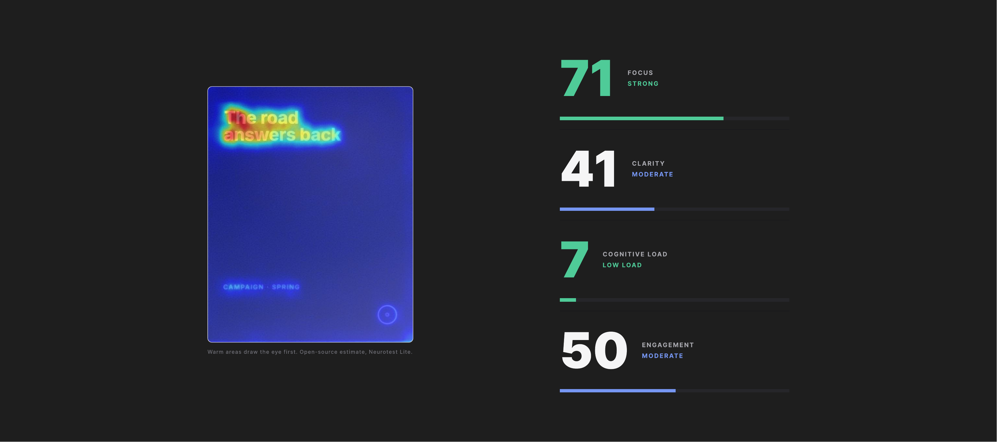
The knowledge base is the source of truth. The plugin is just the hand that reaches into the file.
The proof arrived on the clock.
The hypothesis was tested the only way that counts: under a real deadline. When components were missing days before a launch, they were generated from the system itself, on brand and on time, with no scramble. Consistency wasn't policed at the end; it was structural from the start.
On time, by construction. Missing surfaces produced from tokens and specs, shipped for the deadline with zero visual drift.
Two frameworks live, a third waiting. The web and workflow domains run on one source; the next one is already registered.
Forty drifts to zero. A closed-loop audit reconciled every component spec with shipped reality, then locked it so it stays honest.
A method that repeats. The playbook extracted from the first build made the second faster, and proved again in the Atlas case.
Built for the team it doesn't have yet.
The method was extracted from building the first framework into a reusable playbook, then used to build the second one faster. A third framework is registered and waiting. Every project carries its own operating instructions and living state, so onboarding is a read, not a ritual.
The evolution path is written down before it's needed: a developer-team contract specifies exactly what changes when engineers join (versioning, concurrency, review flows), so today's single-author speed never becomes tomorrow's lock-in. The system anticipates its own growth.